
Times New Roman, I believe, is the font of this blog post. I grew curious about how our fairly long-lasting Roman letters came to be in this form we use today. The Romans, like the Greeks, tended to write in uncial form—what we call “upper case” because printers literally kept them in a case above the “lower case” or minuscule type. Apparently the reason all caps faded from popularity wasn’t that people felt they were being shouted at all the time, but they took too long to write. You’ve probably seen examples of medieval manuscripts where the letters are an odd mix between uncial and minuscule forms. These eventually settled into what is called Roman half-uncial, a font that eventually favored minuscule to majuscule—a name for uncial that has very small, or no, ascenders (as in lower case b or d) or descenders (like lower case p and q).
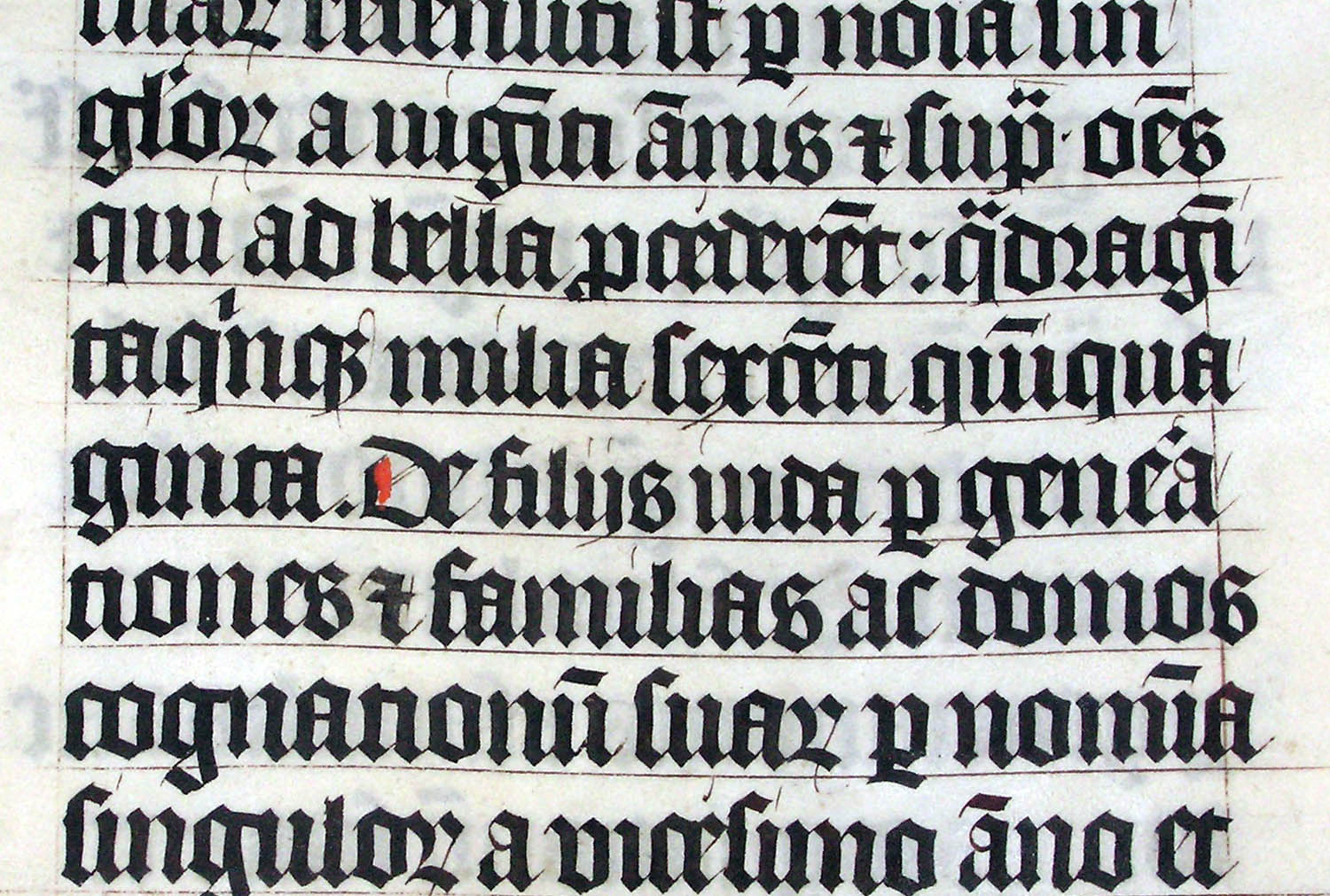
As the power of the Roman Empire waned, a variety of scripts developed in different parts of Europe. One that eventually came to have influence on the nascent Holy Roman Empire was scriptura Germanica, or the German script. Under Charlemagne, the Holy Roman Emperor, the favored, and widespread form of writing Roman letters was carolingian minuscule. This isn’t too difficult to read for modern people but it’s not the script we use. Carolingian minuscule was eventually replaced by blackletter. This heavy, Gothic-looking script isn’t always easy to read. (It was used for German publications until 1941; I used to have an old German book written in blackletter.) Keep in mind that during all this time there was no printing press in Europe; manuscripts were handwritten and read by few. Literacy was rare. Even so, the difficulty of reading blackletter eventually led writers to go back to carolingian minuscule to develop a new writing style, influenced by blackletter as well.
The new writing style, called humanist minuscule, also known as “whiteletter,” is basically what we use today. It comes in several different fonts, of course, but the basic idea of capital letters beginning sentences and proper nouns, but most letters being minuscules, has become the standard for most typefaces based on Latin letter-forms. This history of writing, let alone individual scripts, is amazingly complex. Today fonts have to be licensed to be used by publishers of print materials and techies can invent new fonts to license or sell. I still have a soft spot for the “Roman” style, which is why this blog post, at least on my screen, is in Times New Roman.
